From analysing the three music magazines specific to the genre I am making, I have found that most rock music magazines like to use red and black on their front covers and consistently carry it throughout the whole magazine, these colours signify boldness, power, energy, authority, devotion, sincerity and discipline; these colours can easily be used to describe the type of music the magazines cover. All the magazines use Sans Serif fonts throughout the whole of the magazine as they are easily to read and it is bold which makes the writing stand out. They also use a lot of inserts within the front cover to keep it looking full of information, the contents pages are all separated into different sections and columns giving the layout an organised and clean look. All of the magazines I analysed used an informal mode of address which suits the target audience I will be aiming my magazine for. Two out of the three magazines I analysed all had kickers, pull quotes and stand first to draw the audience to the story and article. From the analysis of existing rock magazines, I should include all these common elements within the genre of magazine such as the using Sans Serif fonts, the informal mode of address, black and red colour scheme and the columns to organise the contents page within the one I am going to create to make a successful design.
Monday 28 November 2011
Sunday 27 November 2011
Specific research into music magazines
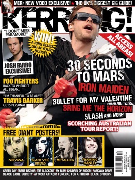
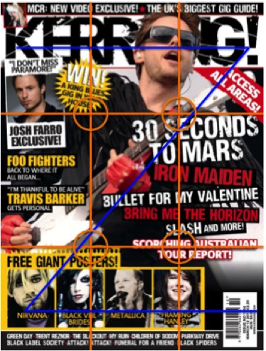
Kerrang front cover
- The guitar signifies rock music which suits the genre of the magazine
- The font is faded near the edges and has splattered spots within, this gives the effect of imperfection suits the genre of music as it does not have to be perfect to be liked, is also very stereotypically associated with rock music and magazines
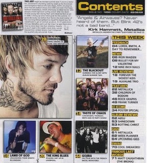
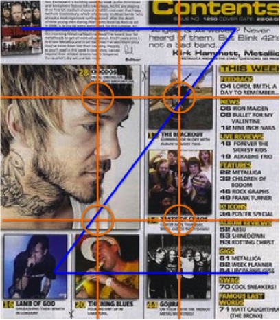
Kerrang contents page
- The contents page of Kerrang uses the same colour scheme of black and yellow which gives the magazine consistency
- There is a large image which suggests that it is the main story in the magazine then there are smaller ones around it which suggests that they are still in the magazine but not the main focus
- The layout is very structured and organised as there are columns
- The content is separated into different sections with headings above which are printed with a black background and yellow font which makes it stand out from the rest of the text on the page and it also acts as a divider from the different topics
- The contents page uses the same font as some of the cover lines on the front page which gives it consistency
- A mixture of images and text are evenly used which would keep a teenage audience more interested as if there is too much text they may not read it at all
- Once again it the contents page is consistent with the colours of black and yellow which signifies strength, wisdom, creative intelligence, wealth, happiness and prosperity, faithfulness, discipline, devotion, sincerity and hard work which once again reflects on the genre of music included in the magazine
- Low angles are used within many of the images within the contents page, this gives the impression of dominance and power which suggests that the music is powerful
- Instruments and microphones are present in some of the images on the contents page which suggests that they are involved in music in some way
- The largest image on the contents page is a close up, this suggests that it is related to one of the main/feature stories within the magazine

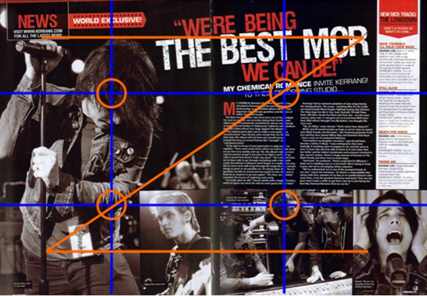
Kerrang double page spread
- The colours black red and white are used on the double page spread which gives the magazine a consistent look throughout
- A stand first is also used on the double page spread with the band name in bolder writing than the rest of the sentence which makes it stand out what band the interview/article is about
- One of the double page spread is used up only with pictures and a little bit of the title going through which signifies that the two pages are on the same topic, and as the image took up one of the pages on a double page spread, it suggests it is one of the main elements within it
- The hotspots on the page are the photos and the pull quote which is also used as a title which makes the readers most attracted to it
- A kicker is also used before the article/interview starts in a different colour and font [same as the pull quote] from the rest of the text to make it stand out and draw the readers in while flicking through the pages of the magazine
- The images used within the double page spread are all in black and white, most of the images are mid shots or close ups which shows you the members of the band, there are individual images as well as a group image to show the relationship within the band
- At the beginning of the route of the eye, the little insert with “NEWS, visit www.kerrang.com for all the latest news” also catches the readers attention to inform of their website which gives them more advertisement
- Near the end of the route of the eye, there are only images, this makes the band more memorable and introduce/remind the readers on what the double page spread is about
- There is a mid shot used of the lead singer of the band the article is about, this makes him the centre of attention as he has an individual page where as the other band members have smaller images along the bottom
- the microphone and instruments within the images signify that they are involved in music
- All the images are taken/edited to be black and white, as black and white are suggested to be "yes and no", "good and bad' without any middle, this can be used to describe the genre of music within the magazine, it suggests that the good and the bad are mixed together within the music to create the best outcome, or something that was not thought to be able to compliment each other does which is just like rock music
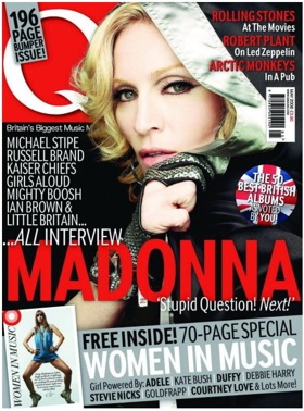
Q Magazine front cover
- Colours used on the front cover of this music magazine is mainly red black and white which gives it consistency from the logo
- Red signifies boldness, bravery, power, energy and authority and white signifies purity and ambition, a pure mind with authority and black signifies faithfulness, discipline, devotion, sincerity and hard work this is representing the genre of music inside
- A mid shot is used on the central image and it is slightly covering the logo
- On the cover lines they use the red for the artist’s names and then white to show the story with them, as they do not have spaces between, it makes it clear that they are onto a new subject
- The name of the artist is the largest font on the page, it is eye catching as it will be one of the first things the reader will see
- There is an insert of a circle with the union jack which support the topic which is (the 50 best British albums)
- There is a slanted banner at the bottom which is reasonably large compared to some cover lines, it will catch the readers attention as it shows certain topics inside the magazine
- The font is large and bold which makes it easy for all readers to read
- The front cover uses the route of the eye and is evenly spaced, there is not much free space but not overlapping so it is easy to follow
- The banner also has names of music artists to attract the readers as it suggests that there will be something in the magazine associated with them
- Using the route of the eye, the last thing you see is “&Lots More!” which would keep the reader thinking and wanting to buy the magazine if they are interested in the specific genre of music
- The cover lines suggest that the mode of address is informal and aimed at a teenage audience as it involves phrases such as “stupid question! Next” it is a stereotypical thing people in their teens and early twenties would say
- The clothes worn by the Madonna in the central image compliments with the colour scheme as red and white stand out in dark colours
- The barcode is near the top right hand corner of the page but under some cover lines, according to the route of the eye, the reader would read the cover line first which could possibly persuade them to buy before seeing the price
- The front page is full of cover lines and inserts which suggests that the magazine has a lot of information inside

Q Magazine contents page
- A large image is used with a smaller image at near the bottom to as they are relevant to the topics in the magazine
- Red, white and black are used in the contents page which is also used on the front cover to give the magazine a consistent look, as mentioned earlier, black, white and red signifies faithfulness, discipline, devotion, sincerity and hard work, purity and ambition, a pure mind with authority and boldness, bravery, power, energy and authority, this represents the genre of music inside the magazine
- The topics are organized in columns which also has headings which makes it easy to find the topic you want to look for
- The date and the issue number is on the top right hand corner
- The larger image is the one which has a bigger feature in the magazine
- The font used on the cover and the contents page are the same which gives it consistency again
- Varied font sizes which makes certain things stand out to the reader which are more important
- The featured artist/band has a different colour for the page number and the heading which makes it stand out from the rest of the page

Q magazine double page spread
- In the double page spread it uses the colour scheme black, red and white which keeps it consistent with the front cover and the contents page
- On one of the pages of the double page spread, it only has a mid shot image on it, it shows that the image is a main part of the double page spread
- The image used is in black and white keeping it very simple which gives it a clean finish
- It occasionally uses kickers in the article/interview, as it is used more than once it suggests that the article/interview is quite in-depth and detailed
- There is a title at the top right hand corner of the page introducing the music artist to show the readers what the double page spread is about
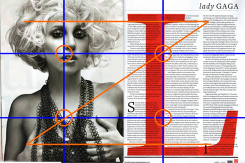
- The main colour [red] is used within this double page spread on the giant ‘L’ that goes through the whole of one page, the text is still readable underneath but it stands out from the black and white and the ‘L’ stands for the ‘L’ in Lady gaga
- The hotspots within the page are either on the photo or the giant ‘L’ which will catch the readers attention
- Using the route of the eye, the last thing you see is the ‘Q’ logo which is the magazine name, this makes the magazine memorable
- All the images are taken/edited to be black and white, as black and white are suggested to be "yes and no", "good and bad' without any middle, it is a very good description of the artist in the article in this case as she has done unexpected, unique things that many people thought were strange but now she has gone global because of it which suggests that there is no right or wrong way of producing music

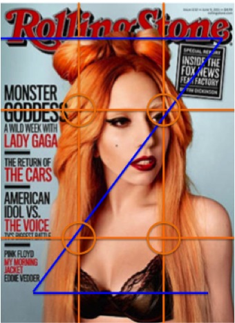
Rolling stones magazine cover
- A mid shot is used on the central image which is slightly covering the logo
- A use of red and black is used on the font which gives it a consistency with the logo, red signifies boldness, bravery, power, energy and authority and black signifies faithfulness, discipline, devotion, sincerity and hard work which represents the genre of music within the magazine
- All the cover lines are all down one side (the left) which makes the central image stand out as it is slight to the right
- Uses the same font throughout the cover lines but varies in the size of the text, the artists names or what they are associated with are larger than the topic within the magazine
- The font is large and bold which makes it easy to read and stand out
- Between the cover lines there is a line between which gives them separation from each other and making the layout look more organized
- The layout and the use of colours are very simple and there is only one insert which uses eye catching words “special report”
- The magazine does not have a barcode on the front cover but does have the date and website on the top right hand corner in a very small font, it is out of the way but the information is still there if the reader wants to know
- The layout isn’t busy and there are no banners or major inserts which gives it a very clean finish
- The target audience may be aimed at a slightly older teens to late twenties as it is a very simple layout and the mode of address is slightly more formal as it is giving out information but not directly talking to the audience
- The magazine layout is simple and organized and not cluttered which suggests that the articles/stories inside would be more detailed rather than having lots of different stories inside
- The front cover is a mid shot, there are no props, the simplicity of the one colour background, it draws the focus to the central image
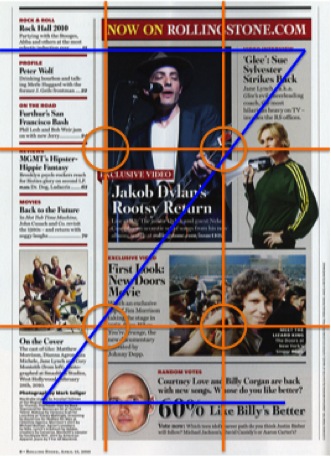
Rolling stones magazine contents page
- Uses the colour scheme of red and black from the cover onto the contents page, red signifies boldness, bravery, power, energy and authority and black signifies faithfulness, discipline, devotion, sincerity and hard work and it represents the genre of music within the magazine just like how it was used in the front cover
- A Colum is used on the side for different pages of the magazine
- There are relevant images to the topics in the magazine used on the contents page which interests the audience
- Inserts such as “exclusive video” is used to catch the readers attention
- Variation on the size of fonts automatically draw the readers eyes in as they stand out
- Red font is used for the headings and the black is used for most of the writing which gives it an organized feel to the layout
- On the contents page theres a variety of images, the largest one is of a musician playing the guitar and singing in the microphone. this suggests that they are involved with music, as it is the largest image on the contents page which suggests that it is one of the main/feature articles
Friday 25 November 2011
Questionnaire results summary
For this task for finding out my specification in the music magazine I am going to produce, I published an online questionnaire as well as one printed on paper.

Male | 9 |
Female | 9 |
From the online and the printed questionnaires, there was an equal amount of male and females who completed them which makes my results fair with perspectives from both genders.

11 to 13 | 0 |
14 to 16 | 9 |
17 to 19 | 5 |
20+ | 4 |
The people who completed the questionnaire were all aged between 14 and 20+ which would make my results useful towards the planning and making of this magazine as the target audience is from teenagers to young adults.

Yes | 5 |
No | 13 |
Male | Female | |
Yes | 5 | 0 |
No | 5 | 8 |
If no why?
Too expensive | 6 |
Don’t have time to read it | 2 |
Not interested in the content | 2 |
Waste after reading | 1 |
the information in the magazine can be found online | 2 |
From the majority of the people who completed the questionnaire, most people aged between 14 and 20+ do not buy magazines often, from the results it shows that more males buy magazines more often than females, this suggests that I should aim my music magazine on male teenagers to young adults.
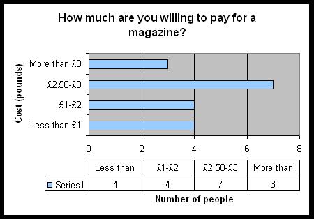
Less than £1 | 4 |
£1-£2 | 4 |
£2.50-£3 | 7 |
More than £3 | 3 |
Most people who completed the questionnaire are willing to pay from £2.50-£3. there were an equal amount of people who put down they are willing to pay £1-£2 or less, as the reasons for people not buying magazines frequently was because they were too expensive, I have decided to keep my music magazine at minimum of £2-£2.50.
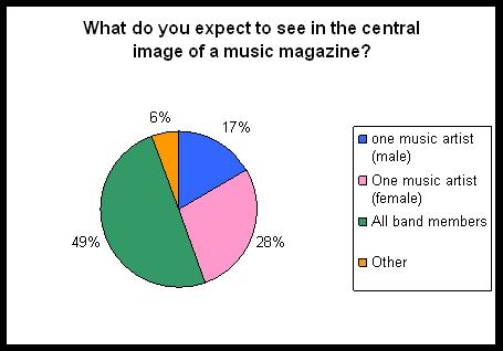
one music artist (male) | 3 |
One music artist (female) | 5 |
All band members | 9 |
Other | 1 |
Male | Female | |
One music artist (male) | 2 | 1 |
One music artist (female) | 4 | 1 |
All band members | 3 | 6 |
Other | 0 | 1 |
From everyone who completed the questionnaire, the majority have voted that they would like all band members to be on the central image of the front cover but as my target audience are males the majority of the males have put they would like to see one music artist (female) on the front cover of the music magazine, this is go under consideration during the planning of my music magazine as either choice would be affective.

Close up | 0 |
Mid shot | 6 |
Wide shot | 1 |
Other | 0 |
This question was only asked on the printed questionnaires as the online questionnaire had a limit of 10 questions only, this question has only been completed by 7 people (6 males and 1 female) this is not the fairest of results but as my target audience are males I thought this would be useful to my planning and making of my music magazine. It shows that most of the people who completed this questionnaire expect a mid shot in the central image; this would come into consideration during my planning as other angles would also be affective depending on the cover lines.
If you had to choose, which genre of music magazine are you most likely to buy? (Can choose more than one)
pop | 8 |
rock | 9 |
classical | 1 |
indie | 2 |
alternative | 1 |
metal | 1 |
R & B | 1 |
Chinese | 2 |
From the completed question it suggests that people aged between 14 and 20+ prefer rock and pop as a music magazine genre, as I am fairly familiar with the rock as a music genre, I will plan and create a rock magazine.

Informal | 15 |
Formal | 3 |
As the people who completed my questionnaire are all within my target audience range and 83% of them have voted that they prefer informal mode of address for a magazine, it is the mode of address I am going to use when I plan and produce my magazine.
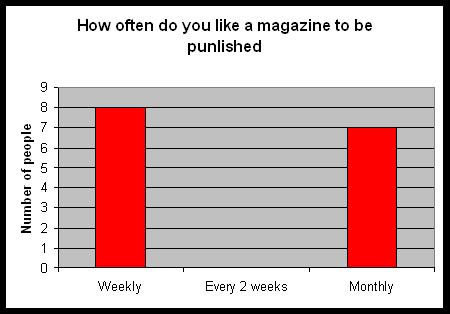
Weekly | 8 |
Every 2 weeks | 0 |
Monthly | 7 |
As it is a very close call between how often the magazine should be published, I am going to go with monthly as I feel monthly magazines can be filled with a lot more information which would help me to fill up the front page of my music magazine.
What age do you think a music magazine should be aimed for?
Teenagers to young adults | 5 |
All ages | 2 |
13-20 | 5 |
14 and over | 2 |
16-20 | 2 |
16-25 | 1 |
16-30 | 1 |
From the questionnaire completed the people voted that they feel music magazines are mainly aimed at teenagers to adults (aged between 13 and 20).
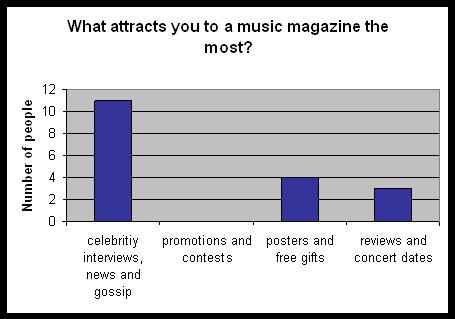
celebrity interviews, news and gossip | 11 |
promotions and contests | 0 |
posters and free gifts | 4 |
reviews and concert dates | 3 |
Male | Female | |
Celebrity interview, news and gossip | 6 | 5 |
Promotions and contests | 0 | 0 |
Posters and gifts | 0 | 4 |
Reviews and concert dates | 3 | 0 |
From the results above, it suggests that teenagers and young adults are most interested in celebrity interviews, news and gossip, followed by posters, free gifts, reviews and concert dates, from the previous question as I am aiming at a male audience, as it shows above males are most interested in celebrity interview, news and gossip so I am going to include this in my planning and creating of the magazine to achieve the best possible product.
Subscribe to:
Posts (Atom)